4 iPhone Camera Secrets Pro Photographers Actually Use
There's something frustrating about scrolling through social media and seeing those stunning photos with dreamy blurred backgrounds and vibrant colors, then looking at our own camera roll and thinking, "Why don't mine look like that?"
Here's the truth: the gap between our photos and those eye-catching shots isn't about having better equipment. It's about knowing how to properly use what we already have. Our iPhones are ridiculously powerful cameras, but we're probably not using them to their full potential.
Let's change that today. We're diving into the four core fundamentals of iPhone photography that will genuinely level up our images. No fluff, no complicated jargon, just practical techniques we can start using immediately.
Master Camera Modes: The Right Tool for Every Shot
When we open our Camera app, there's that carousel of words at the bottom: Portrait, Photo, Pano, and more. Most of us just leave it on Photo and hope for the best. This might be our first mistake, but it's an incredibly easy one to fix.
Think of these modes as different brushes for an artist. We need to pick the right one for what we're creating. Yes, iOS is getting smarter about making these decisions for us, but we still can't fully trust it to make the right call every time. Double-checking is worth it.
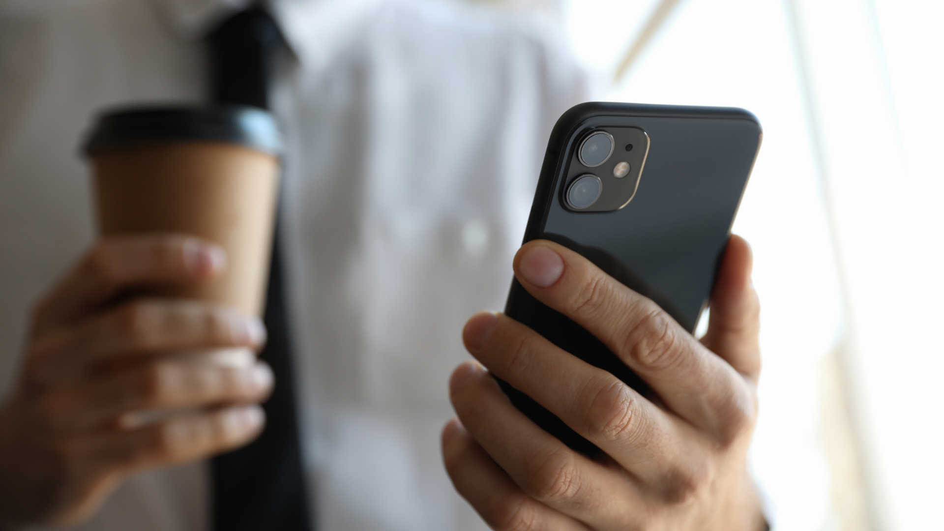
Photo Mode is our all-purpose workhorse. It's fantastic for everyday snapshots and street photography because it's designed to be fast and reliable. But here's the secret: we need to take control of focus and exposure instead of just pointing and shooting.
Try this next time: tap on the most important part of our image (the subject), and we'll see a yellow box pop up. That's us telling our iPhone, "Hey, this is what matters. Make sure it's sharp." But it gets even better. See that little sun icon next to the box? Slide our finger up and down on the screen, and we can manually adjust brightness before even pressing the shutter button.
Ever taken a photo of a gorgeous sunset only to have the sky blown out into a horrible white mess? Here's the fix: tap on the sky, then slide our finger down. Watch those brilliant colors come back as we darken the shot. It's almost magical.
For an even more powerful trick, tap and hold the screen until we see "AE/AF Lock." This locks our exposure and focus, which is perfect when there's movement in the scene that might confuse our camera. Cameras on phones are smart, but not smart enough to know they need to maintain our chosen settings without explicit instruction.
Portrait Mode is the secret sauce for that beautiful blurry background effect, often called bokeh. This mode uses our iPhone's software and multiple lenses to identify our subject, separate it from the background, and artistically blur everything else out. It's different from what we'd get with a real lens on a DSLR, but for many photos, it's good enough, especially when we don't have other gear with us.
While it's designed for portraits of people, it works wonders on pets, food, and other objects. Pretty much anything we want to make the star of the show. The key is having some space between our subject and whatever's behind them, and avoiding overly busy backgrounds that might confuse the camera.
Here's something many people don't know: we can edit that blur after taking the picture. Open the photo, tap Edit, then tap the little F icon. That slider lets us increase or decrease the background blur, giving us total control. Even better, with newer iPhones, we might not even need to be in Portrait mode because the camera often captures depth information automatically, letting us add the portrait effect later.
Pano Mode is a sleeper hit because its name is somewhat limiting. Yes, it's great for panoramic pictures, but it's also perfect for dramatic landscapes, big city skylines, or group photos where we can't back up any further. One warning though: if people are moving while we're capturing the pano, some weird and even creepy results can happen.
To use it, tap the shutter and slowly pan our phone across the scene, keeping that little arrow on the line. The trick is being as steady as possible. Moving our whole body instead of just our hands and wrists helps. Any jerky movement creates weird, ugly stitching lines in the final image.
Night Mode kicks in automatically when our camera detects low light, indicated by a yellow moon icon. This mode is pure magic because it takes multiple pictures over a few seconds and blends them together to create one single image that's brighter, clearer, and less grainy.
Pay attention to the number next to the icon (like "3s"). That's how long we need to hold our phone still for the exposure. The longer the exposure, the more critical it becomes to hold perfectly still. For the absolute best results, prop our phone against a wall, rock, or mini tripod, and set a timer. This gives us reliable stability and unbelievably sharp, clean photos in the dark.
Don't forget about the different lens options at the bottom of our camera: 0.5x, 1x, 5x, and so on. The lowest number gives us ultra-wide shots perfect for huge scenes. The 1x is generally the sharpest and best all-around lens (we should use it as much as possible). The telephoto lets us zoom in without losing image quality because it's an actual physical zoom, not just a digital crop.
We've probably heard about "zooming with our feet," which just means walking closer. But when we can't, switching to that telephoto lens is a thousand times better than pinching the screen to digitally zoom, which drastically decreases photo quality.
Unlock Camera Settings: The Control Panel for Creativity
Taking a few minutes to explore the Settings app might sound boring, but it will save us so much frustration and level up every photo we take from now on.
First, turn on the Grid. Go to Settings, scroll down to Camera, and flip the switch for "Grid." This overlays a simple 3x3 grid on our camera screen, and it's the key to one of the most important rules in all of art: the Rule of Thirds (we'll get to that soon). While we're there, also turn on "Level." This adds a floating line that turns yellow when our camera is perfectly level, which is our tool against crooked horizons.
Crooked horizons are one of those things that, if we're not experienced enough, we won't notice consciously, but we'll get weird vibes from pictures that have them. Let's avoid that.
Next, let's get a little geeky with Formats. We'll see two options: High Efficiency or Most Compatible. High Efficiency saves photos as smaller files, while Most Compatible uses classic JPEG but creates slightly bigger files. For most of us, High Efficiency is totally fine.
But inside this menu, there's the holy grail: Apple ProRAW. If we have an iPhone Pro, we'll see a toggle for it. Turn it on. What is it? A normal photo is already processed by the phone, making decisions about color and contrast for us. A RAW file, on the other hand, is the unprocessed raw data straight from the camera sensor.
This gives us an unbelievable amount of information to work with when editing, letting us rescue details from bright skies and dark shadows that would be completely lost otherwise. Files will be way bigger, so be mindful of when we need it. We probably don't need it for photos of our lunch, but if we're on a hike and smartly decided not to bring a big camera because it's too heavy, ProRAW becomes non-negotiable.
Preserve Settings is a huge quality-of-life improvement. Ever set up our camera just right, only for it to reset the next time we open the app? This option is the fix. We personally recommend preserving Camera Mode, Creative Controls, and especially Exposure Adjustment. That way, if we're working in a consistently dark place, we don't have to keep readjusting every time.
Photographic Styles can be found in camera settings or in the app itself. Unlike a filter that's slapped on top of a photo, photographic styles are applied intelligently while the photo is being taken. This is key because it adjusts tone and warmth while protecting natural skin tones.
If we're complete beginners, we don't necessarily need to make changes to specific photographic styles, but we should play around with them overall. It's a great way to start developing a consistent look for our photos without doing extensive editing every time.
Finally, let's talk about Live Photos. When we get a phone, this is on by default. A Live Photo is a tiny three-second video of what happened before the photo. This can be great for capturing a bit of motion. Some of us love it, others don't, but there's a hidden superpower: creating long exposures.
If we take a Live Photo of a waterfall or moving cars and then change it to Long Exposure, the phone magically blends all that motion into a silky smooth blur. This is an effect that used to require expensive gear, a DSLR, and even filters.
The Rules of Composition: How to Create Compelling Images
This section is arguably the most important part of the whole process. It doesn't matter if we have the best camera and the best settings if our composition isn't up to par. The photo will just fall flat.
Composition is simply the art of arranging things in the frame to tell a story and guide the viewer's eye. There are a few rules we need to know in the beginning so we can learn how to break them later when we have more experience.
This brings us back to that grid we turned on in the camera settings. That grid is our training wheels for the Rule of Thirds. The idea is simple: instead of sticking our subject right in the dead center, we place it along one of the grid lines or, even better, at one of the points where two lines cross. Our eyes are naturally drawn to these points.
If we're taking a picture of a person in a field, don't put them right in the middle. Line them up with the left or right vertical lines, and watch how the whole image feels more dynamic. Of course, this isn't always the case. This is just a starting point. Eventually, we can break this rule for artistic purposes. Learn it, play around with it, then break it.
Leading Lines are lines in our photo that can be roads, paths, fences, rivers, or basically anything that guides the viewer's eye through the image, usually toward our main subject. The next time we're taking a picture, stop for a few seconds and look for lines in our frame. If we see them, we can change our position to use them better and adjust our frame in the process.
Negative Space is something some people are afraid of, but we shouldn't be. Sometimes what we leave out of the photo is just as important as what we put in. Negative space is the empty area around our subject. When we're starting out, we probably want to fill the frame with as much as possible, but if we want subjects to stand out, we need to take things out of the frame. This creates a sense of scale and minimalism. Resist the urge to fill every frame every single time and let our subjects breathe a little bit.
Symmetry and Patterns are personal favorites. Our brains are hardwired to love symmetry, so look for scenes that have it. It could be man-made, like a building facade, or natural, like a mountain's reflection in a lake. For these shots, we can break the Rule of Thirds and place our subject right in the center to emphasize that perfect balance. In the same way, keep an eye out for repeating patterns and textures: brick walls, rows of trees, specific textures on clothes. All of this can make for really cool, almost abstract photos.
Here's a simple trick that will instantly make our photos better: Change Our Perspective. Most of us take photos from chest height, and that's why so many photos look boring or very similar. Get low on the ground for a more dramatic, powerful angle, or find a higher vantage point for a bird's eye view. Basically, try to look for views that aren't common for us humans.
Different perspectives make different photos every time. Shooting from down low can make a subject look larger than life, and shooting from up high can reveal patterns and geometry we'd completely miss otherwise.
Finally, use Framing to add depth. Look for things in the foreground that we can photograph through to create a natural frame around our subject. This could be a doorway, window, arch, or even overhanging tree branches. This technique does a few amazing things: it adds a sense of depth by creating layers in the photo, and it draws the viewer's eye exactly where we want it to go, to the subject inside the frame.
The 60-Second Edit: Bringing Our Photos to Life
Taking a photo is only half the story. The rest of the magic happens in the editing app, where we'll be refining our vision and making our images pop while giving them our specific style.
A lot of people are intimidated by editing, thinking they need complicated software like Photoshop or Lightroom. The truth is, we can do 80 percent of what we need right inside the iPhone's own Photos app. And here's the kicker: it can take less than a minute.
Here's a three-step editing recipe.
Step One: Crop and Straighten. This is the very first thing we need to do, checking our composition if we didn't do it while taking the picture. Tap the crop icon and check: Is the horizon level? If not, use the straighten tool and fix it. Is the composition a bit weak? Remember the Rule of Thirds and crop in to reframe our subject, cutting out any distracting elements on the edges.
Step Two: Adjust Light and Contrast. Now let's get into the adjustment dials. Sometimes we can tap that little magic wand icon for Auto Adjust just to see what it does. Sometimes it works quite well, other times not so much. Give it a tap, and if the iPhone gods are happy today, it'll give us a perfect starting point.
The two most important sliders here are Exposure (the sun icon) and Contrast (the half-white circle). Exposure is the overall brightness, and contrast is the difference between the dark and light parts of the picture. Pushing contrast a little bit can make our photo pop, but we need to be gentle. The biggest mistake people make is over-editing, and adding more contrast can also add unwanted saturation.
After making these changes, we often tweak the Highlights and Shadows sliders. If the sky is too bright, bring down the highlights to recover detail. If the shadows are too dark, lift them up to reveal what's hiding there.
Step Three: Adjust Color. The final step. The two sliders that matter most here are Warmth and Vibrance. Warmth is the color temperature (basically, how blue or yellow our image will be). Blue equals cold, yellow equals warm. Adjust this to match the feeling we want to create.
Vibrance is a brilliant tool that boosts the muted colors in the photo without making skin tones look weird and orange. It's much more natural than the old saturation slider. A little kick of vibrance can make our photos look rich and beautiful.
That's it. Crop, light, color. Three steps. Once we get the hang of it, we can take a photo from flat to fantastic in under 60 seconds. If we use ProRAW, we'll notice even more freedom with the sliders, especially when recovering highlights and shadows.
Taking Action
The power to create stunning photos has been in our pocket the whole time. We just need to know how to use it and practice consistently. These four fundamentals work together: mastering our camera modes gives us the right tool for each situation, optimizing our settings gives us creative control, understanding composition helps us tell compelling visual stories, and quick editing brings our vision to life.
Start with one technique at a time. Turn on that grid today and practice the Rule of Thirds for a week. Then dive into camera modes. Then experiment with settings. Build these habits slowly, and soon they'll become second nature.
The best camera is the one we have with us, and for most of us, that's our iPhone. Let's stop making excuses about gear and start making better photos with what we already have. The journey from snapshots to art starts right now.